CSS Flex 활용 (Flexible Box) 1
우리는 가로형 레이아웃을 잡을 때 float, inline-block을 사용했습니다.
또는 극단적으로 absolute 포지션을 사용하기도 했습니다.
이는 구현은 가능할 수 있으나 css의 의미있는 사용도 안될뿐더러 불편하거나 유연하지 못합니다.
float은 콘텐츠를 부유해서 보여주고 inline-block은 다른 콘텐츠와의 배치를 결정하는데 쓰입니다.
absolute 포지션을 절대적인 위치값을 가진 요소를 나타내는데 쓰입니다.
Flex는 요소의 정렬과 배치를 행과 열로 구분하여 효과적으로 할 수 있는 CSS 레이아웃 모델입니다.

IE10~11에서 일부 지원합니다.
기타 모던 브라우저에서는 모두 지원합니다.
1.구조
아래와 같은 기본 구조로 진행합니다.
HTML
<div class="box">
    <div class="item item--1">
        1 <br>
        Lorem <br>
        ipsum
    </div>
    <div class="item item--2">
        2<br>
        Lorem ipsum dolor sit amet.
    </div>
    <div class="item item--3">
        3 <br>
        Lorem ipsum dolor sit amet, <br>
        consectetur adipisicing elit. Hic, voluptatem?
    </div>
    <div class="item item--4">
        4 <br>
        Lorem ipsum dolor sit amet, consectetur adipisicing elit.<br>
        iste molestias reiciendis sint suscipit!
    </div>
    <div class="item item--5">
        5 <br>
        Lorem ipsum dolor sit amet, <br>
        consectetur adipisicing.
    </div>
</div>
CSS
<style>
    .box {
        display:flex;
    }
    .item {
        padding:20px 10px;
        color:#fff;
    }
    .item:first-letter {font-size:50px}
    .item--1 {background:#0080cc;}
    .item--2 {background:#cc3a2f;}
    .item--3 {background:#01cc49;}
    .item--4 {background:#cca514;}
    .item--5 {background:#9a25cc;}
</style>
.box(Flex Container) : Flex Item을 감싸고 있는 영역입니다.
.item(Flex Item) : Flex Item 입니다.
Flex에서 사용할 수 있는 CSS는 컨테이너에 적용하는 속성과, 아이템에 적용하는 속성으로 나뉘어 있습니다.
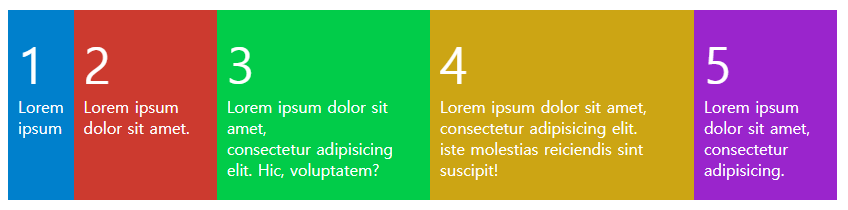
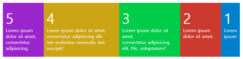
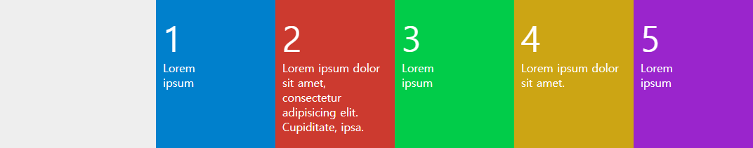
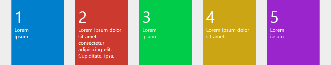
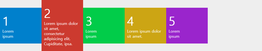
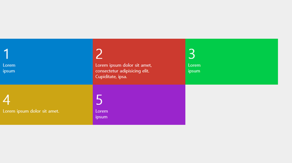
RESULT
화면에 넘치지 않을 때
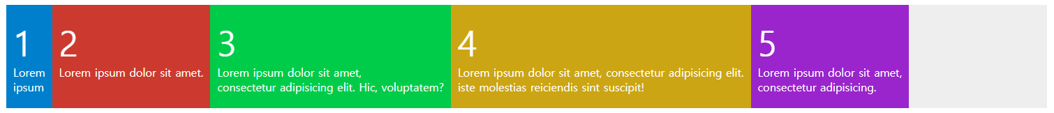
화면에 넘치지 않을 때
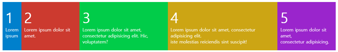
flex 속성 추가만으로 float이나 inline-block으로 만들었던 레이아웃을 쉽게 만들 수 있습니다.
요소의 넓이에 따라 배치되며, 넘칠때에는 아래로 떨어지지 않고 자연스럽게 줄어듭니다.
flex-flow (컨테이너에 적용)
flex-flow는 flex-direction, flex-wrap이 합쳐진 축약 속성입니다.
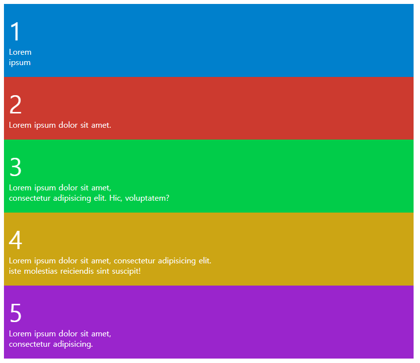
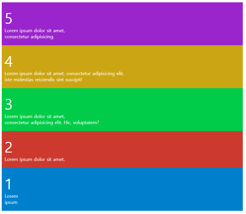
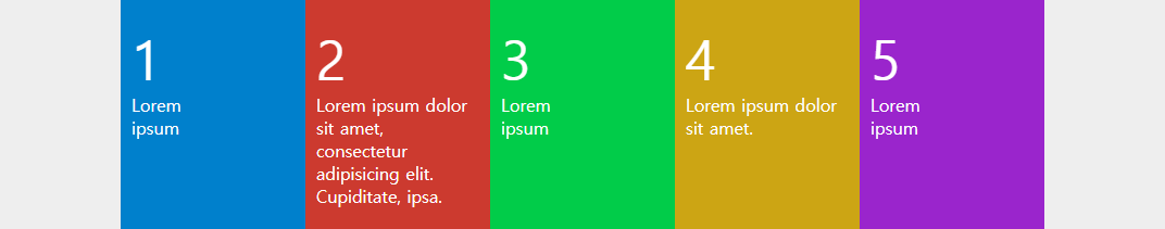
flex-direction:(direction, 기본값 row)
item 요소의 정렬 방향을 결정합니다.
<style>
    .box {
        flex-direction:row-reverse; //요소 방향 -> (기본값)
        flex-direction:row-reverse; //요소 방향 <-
        flex-direction:column; //요소 방향 ↓
        flex-dirction:column-reverse; //요소 방향 ↑
    }
</style>
RESULT
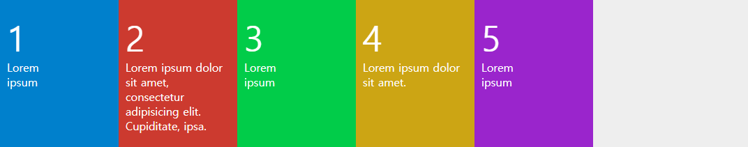
flex-direction:row
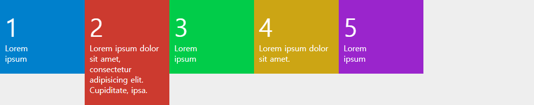
flex-direction:row-reverse
flex-direction:column
flex-direction:column-reverse
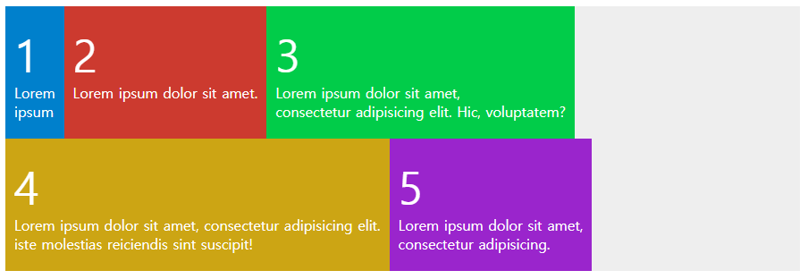
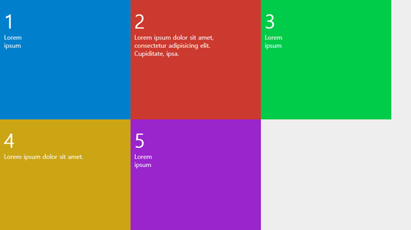
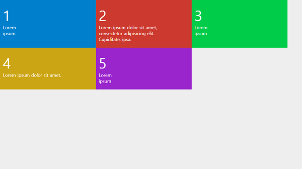
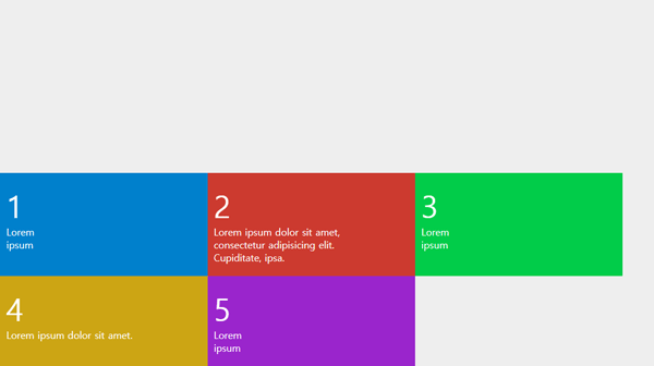
flex-wrap:(wrap,nowrap, 기본값 nowrap)
넘치는 item 요소에 대하여 표시 방법을 결정합니다.
<style>
    .box {
        flex-wrap:wrap; //넘칠 경우 줄바꿈 합니다.
        flex-wrap:nowrap; //컨테이너 폭에 맞게 줄어듭니다.
    }
</style>
RESULT
flex-wrap:wrap
flex-flow:(direction wrap)
아래와 같이 축약 속성으로 사용합니다.
.item {
    flex-flow:row wrap;
    flex-flow:column nowrap;
    flex-flow:row-reverse wrap;
    flex-flow:column-reverse nowrap;
}
justify-content (컨테이너에 적용)
메인축 방향의 아이템들을 정렬 방식 속성입니다.
메인축과 교차축은 flex-direction에 따라 달라집니다.
정렬 확인을 위해 아이템에 flex-basis로 넓이값을 주었습니다.
<style>
    .box {
        display:flex;
        justify-content:flex-start;
        justify-content:flex-end;
        justify-content:center;
        justify-content:space-between;
        justify-content:space-around;
        justify-content:space-evenly;
    }
    .item {
        flex-basis:150px;
        padding:20px 10px;
        color:#fff;
    }
</style>
RESULT
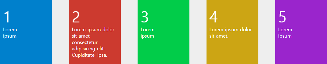
justify-content:flex-start

초기값입니다.
justify-content:flex-end
메인축의 끝부터 정렬 합니다.
justify-content:flex-center
가운데 정렬합니다.
justify-content:space-between
아이템을 좌우끝에 붙이고 나머지 공간은 균등 분배합니다.
justify-content:space-around
아이템을 감싸고 있는 여백을 균등 분배합니다.
justify-content:space-evenly
모든 여백을 균등 분배합니다.
align-items (컨테이너에 적용)
교차축 방향의 아이템들을 정렬 방식 속성입니다.
이해하기 쉽게 justify-content는 가로 정렬, align-items는 세로 정렬로 이해합니다.
<style>
    .box {
        display:flex;
        align-items:stretch;
        align-items:flex-start;
        align-items:flex-end;
        align-items:center;
        align-items:baseline;
    }
    .item {
        flex-basis:150px;
        padding:20px 10px;
        color:#fff;
    }
</style>
RESULT
align-items:stretch
교차축을 꽉채워서 정렬합니다.
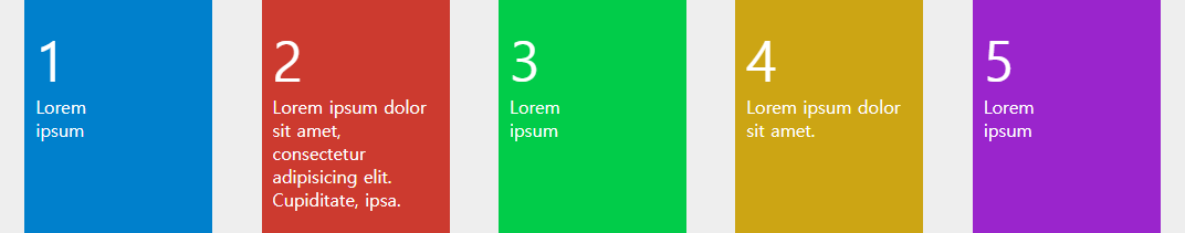
align-items:flex-start
교차축 시작점으로 정렬합니다.
align-items:flex-end
교차축 끝점으로 정렬합니다.
align-items:center
교차축 중앙에 정렬합니다.
align-items:baseline

텍스트 베이스라인 기준으로 정렬합니다.
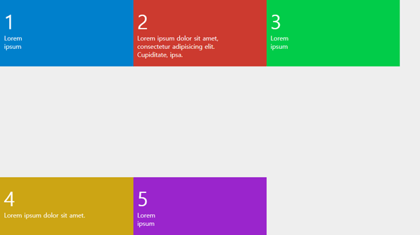
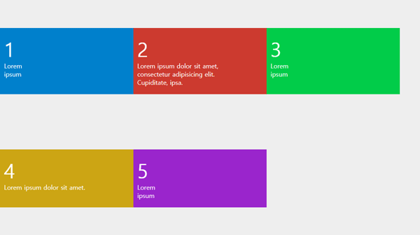
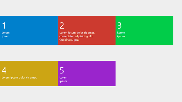
align-content (컨테이너에 적용)
flex-wrap 속성으로 줄바꿈된 아이템들을 정렬합니다.
컨테이너에 높이값을 주었고, 아이템의 줄바꿈 되기위해 flex-basis 값을 주었습니다.
<style>
    .box {
        display:flex;
        height:600px;
        flex-wrap:wrap;
        align-content:stretch;
        align-content:flex-start;
        align-content:flex-end;
        align-content:center;
        align-content:space-between;
        align-content:space-around;
        align-content:space-evenly;
    }
    .item {
        flex-basis:320px;
        padding:20px 10px;
        color:#fff;
    }
</style>
RESULT
align-content:stretch
교차축을 꽉채워서 정렬합니다.
align-content:flex-start
교차축을 시작점으로 정렬합니다.
align-content:flex-end
교차축을 끝점으로 정렬합니다.
align-content:center
교차축을 중앙으로 정렬합니다.
align-content:space-between
아이템을 교차점 시작과 끝에 붙이고 나머지 공간은 균등 분배합니다.
align-content:space-around
아이템을 둘레를 균등 분배합니다.
align-content:space-evenly
모든 여백을 균등 분배합니다.