Flex로 만든 목록 레이아웃
flex로 가장 많이 만드는 레이아웃 중 하나가
justity-content:space-between을 활용한 양쪽 정렬 레이아웃입니다.
이 CSS를 활용한 두 가지 레이아웃을 만들어 보겠습니다.
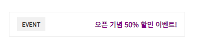
1 Element
한 개의 버튼 요소가 풀로 채워 집니다.
HTML
<div class="flex">
    <div class="flex-item">
        <button type="button">Submit</button>
    </div>
</div>
CSS
.flex {
    display:flex;
    justify-content:space-between
}
.flex-item {
    flex-grow:1;
    flex-shrink:0;
    word-break:break-all
}
.flex-item button {
    width:100%;
    padding:15px 0;
    border:1px solid #f1f1f1;
    background:purple;
    font-weight:600;
    color:#fff
}
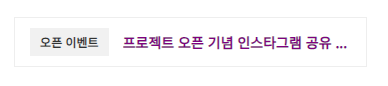
RESULT

2 Element
두 개의 요소가 표시되고 글자가 넘칠경우 줄임표가 표시됩니다.
HTML
<div class="flex">
    <div class="flex-item">
        <span class="badge">
            오픈 이벤트
        </span>
    </div>
    <div class="flex-item">
        <p>
            프로젝트 오픈 기념 인스타그램 공유 이벤트!
        </p>
    </div>
</div>
CSS
.flex {
    display:flex;
    justify-content:space-between
}
.flex-item {
    flex-grow:1;
    flex-shrink:0;
    word-break:break-all
}
.flex-item ~ .flex-item {
    flex-grow:0;
    flex-shrink:1;
    min-width:0;
    margin-left:1rem
}
.flex-item button {
    width:100%;
    padding:15px 0;
    border:1px solid #f1f1f1;
    background:purple;
    font-weight:600;
    color:#fff
}
.flex-item p {
    overflow:hidden;
    padding:4px 0;
    text-overflow:ellipsis;
    white-space:nowrap;
    font-weight:600;
    color:purple
}